JASPER KING!
Politics of Image and Text folio 2024!
This project aims to outline urban heat island effect as an issue of climate change and global warming. This is presented through a zine and poster, detailing key information, its effect on Sydney (particularly Western Sydney), and ways in which people can make a change.
The zine takes the thematic form of a combat guide, driving the urgency, and critical nature of urban heat, offering readers the important facts and solutions to 'combat' the problem. This is furthered through the limited but bold colour and typeface selection, forming an urgent and thematically cohesive piece.
The poster features a direct confrontational statement and call to action in bold colouring and lettering that contrasts greatly with the black and white collaged background, in order to command a readers attention from a far. This background offers a visually interesting interpretation of the urban heat island effect, encouraging viewers to interact and hopefully read the contents of the zine.
Keywords: Urban, heat, cool.

Material Research
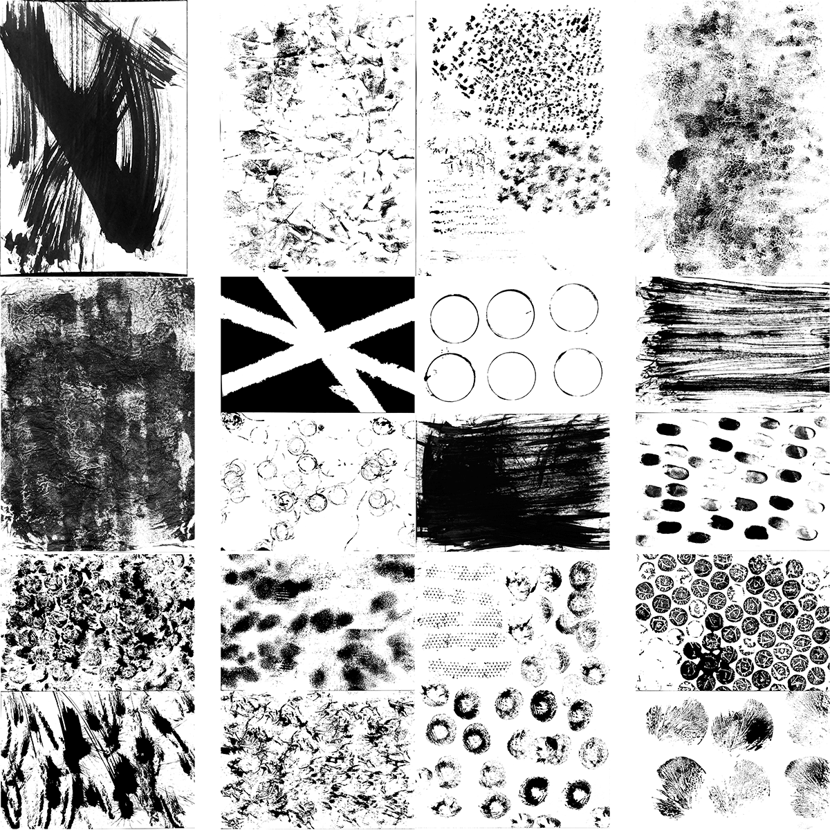
Mark making experiments, ink + found objects, scanned and adjusted in Adobe Photoshop. These were later implemented in the 'Urban Heat Island Effect' title, and 'J Jinx Publications' text on the back page.
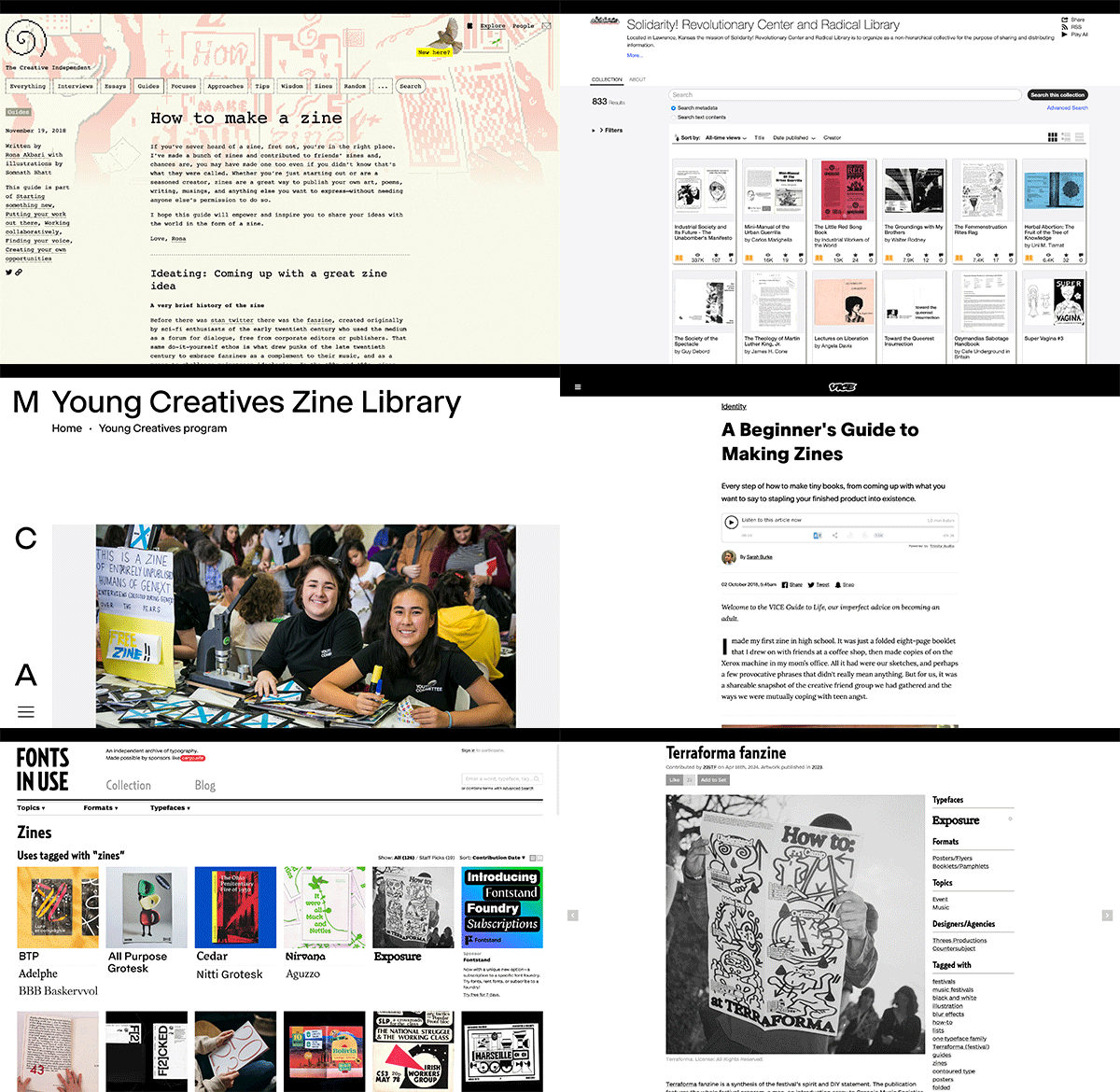
Various sites used as a basis to build upon; multiple guides to zine making, zine archives, and archives of fonts used within zines.
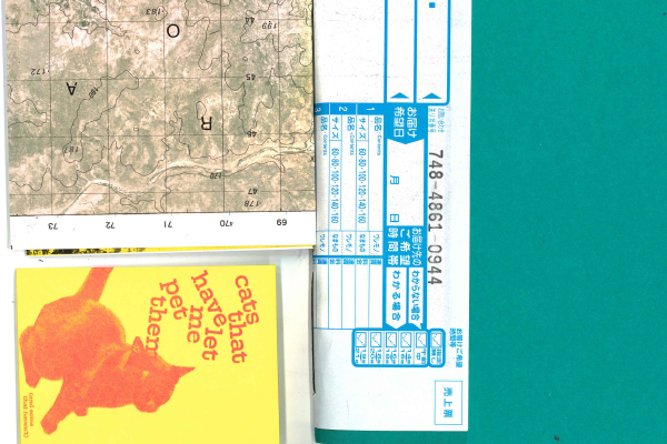
Zines acquired at 'The Rizzeria Zine Fair' on 11/5/24. Chatting to various creators about methods and zines inspired me greatly.
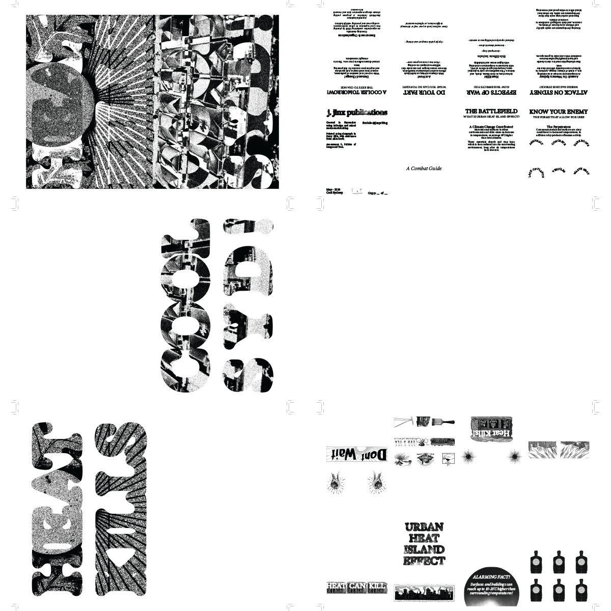
Designs exported onto seperate layers and converted to black-and-white, seperated by colour required in the printing process. Note the use of bleed and crop marks in the corners, ensuring a proper cut after printing.
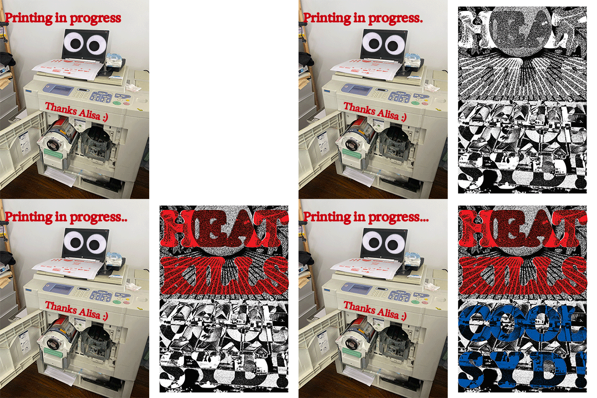
Riso printing with Alisa! Each layer is printed seperately in accordance with colour. The printer had googly eyes!

Typeface used through project, Exposure. This shows the progression of adjustable weights from -100 to +100. Found on the 'Fonts In Use' archive under the 'zine' category.
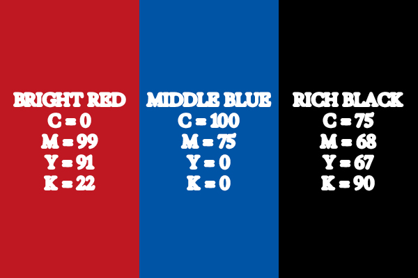
CMYK colours utilised for printing (pre-riso), rich black was implemented to have a deeper black when printing, using all colours instead of only K (black).
Concept Research
My concept research comprised of experimenting with zine creation, sketching poster thumbnails, and studying urban heat island effect through Government sites.
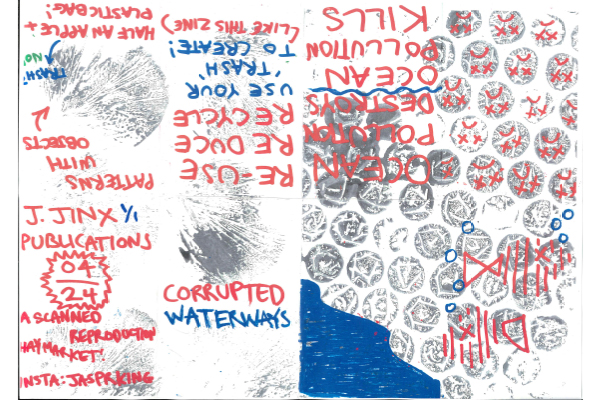
First mock zine - prior to finalised concept. The initial red and blue colouring of key elements carried throughout the whole project.
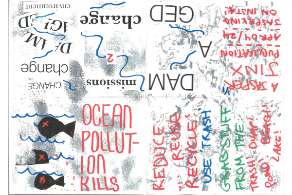
Second mock zine - prior to finalised concept.
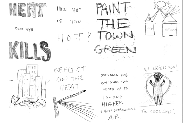
In-class crazy 8 prompts for poster development - post finalised concept.
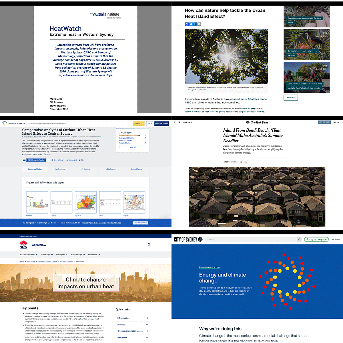
Further research into the urban heat island effect, with a focus on Western Sydney.
Iterative Process
My iterative process comprised of experimenting with markmaking, sourcing and editing images and illustrations from archives, and adjusting formatting.
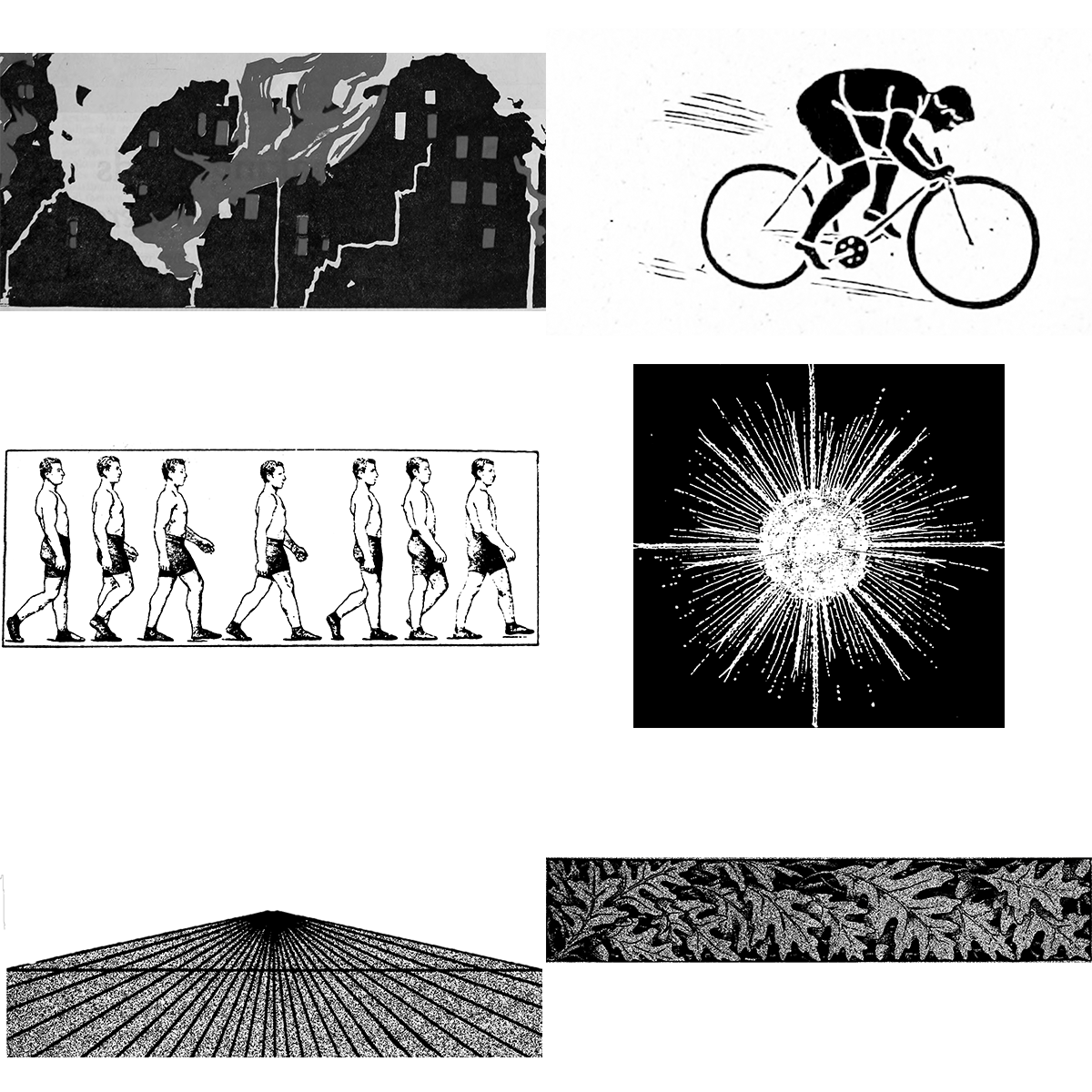
Various public domains illustrations sourced from 'Internet Archive Book Images' on Flickr, of which were downloaded, adjusted in Photoshop, and brought into Indesign to be manipulated further for use in the zine and poster.
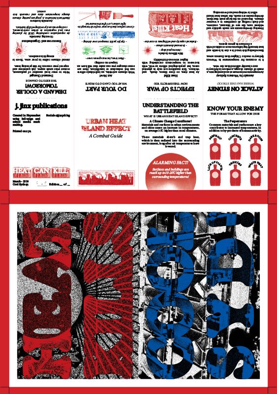
Before learning how to properly implement bleed, a red border was used to cut, results were okay but underwhelming, and not the correct way to execute this process. I then self taught the proper way to implement bleed, through online tutorials.

Poster iterations. 'Sydney' was changed to 'Syd!' as to better match the 4 character words appearing above.
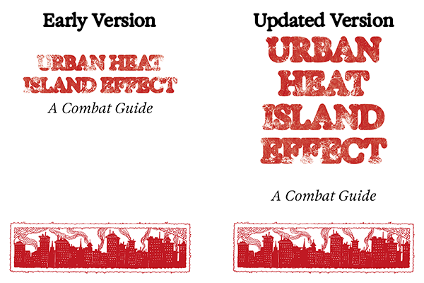
Front cover iteration.
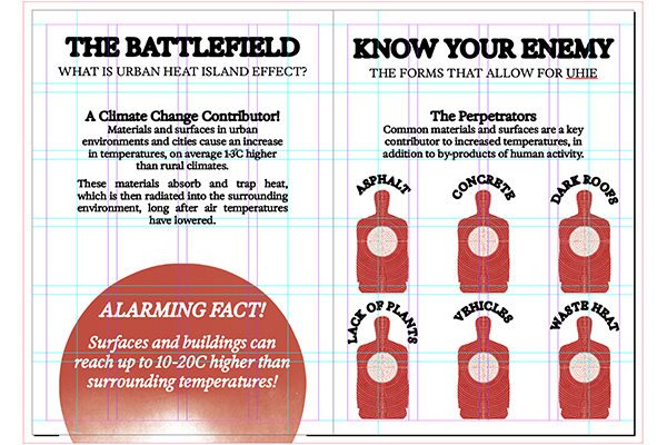
Modular grid and bleed mark usage.
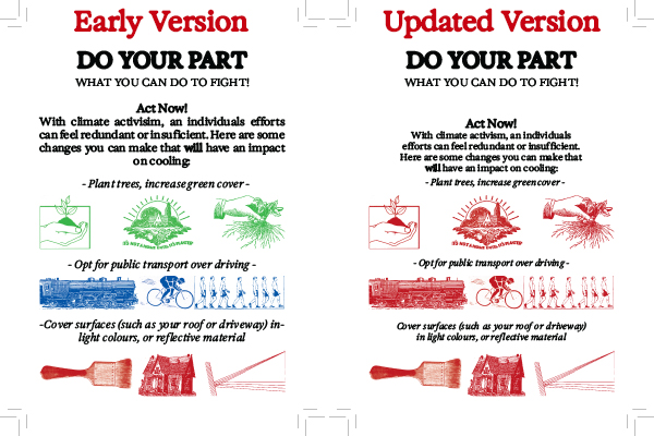
Example of early version using multiple colours, which was later converted to match the red found throughout the rest of the zine. This arose partially from a limitation of printing with riso, but ended up working better as it created a more cohesive feel.
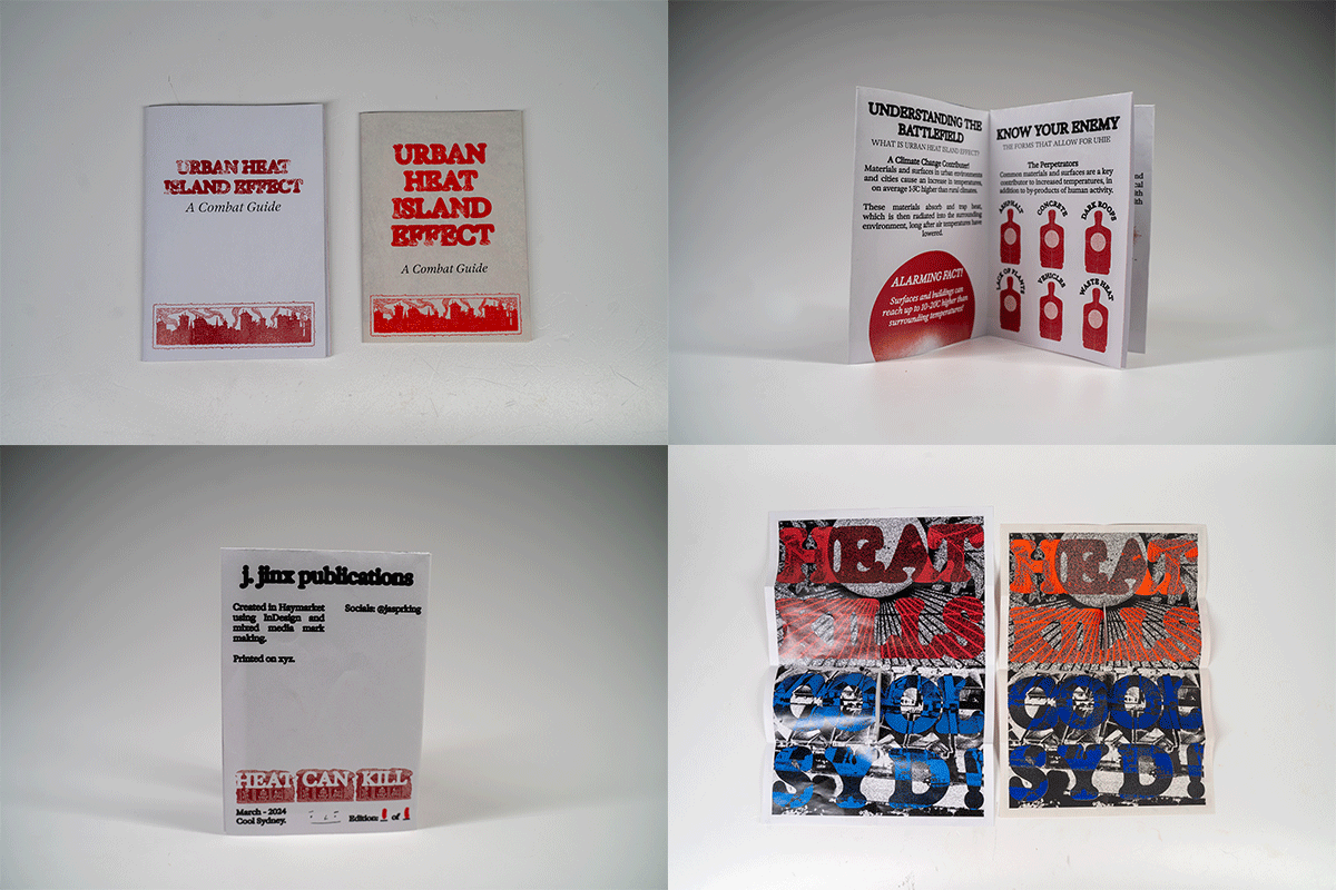
Iteration (left) vs. final (right). Iterations printed at UniquePrint, Glebe on SRA3, final printed using risograph on A3.
Poster Design
A tricolour poster featuring text atop a self collaged background. The collage aims to visualise the impact of heat on housing developments in Sydney's west.
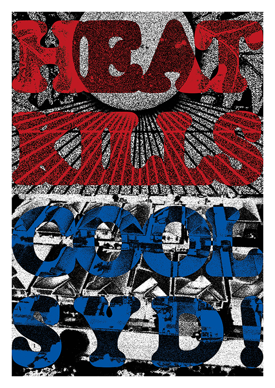
Digital poster.
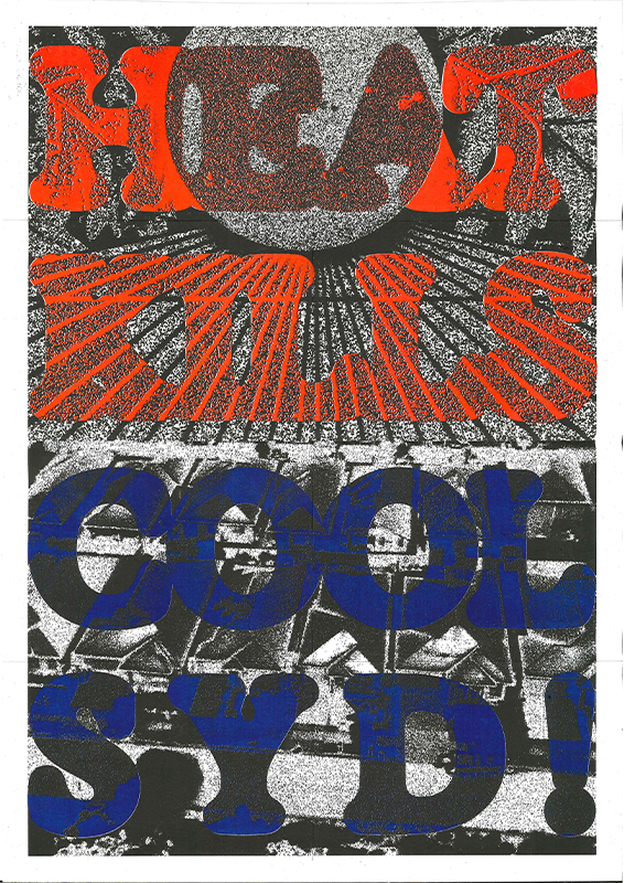
Printed (risograph) and scanned poster.
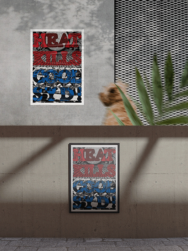
Poster mockups.
Zine Design
This zine takes the form of a combat guide, detailing the effects of urban heat island effect and how readers can make an impact.
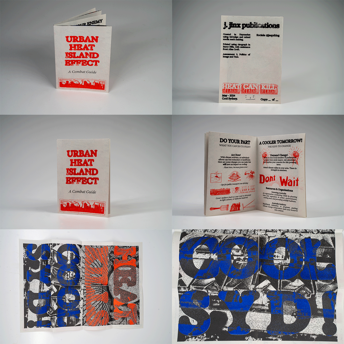
Final risograph zine and poster photographed.
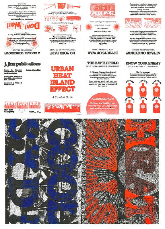
Final risograph zine and poster scanned.
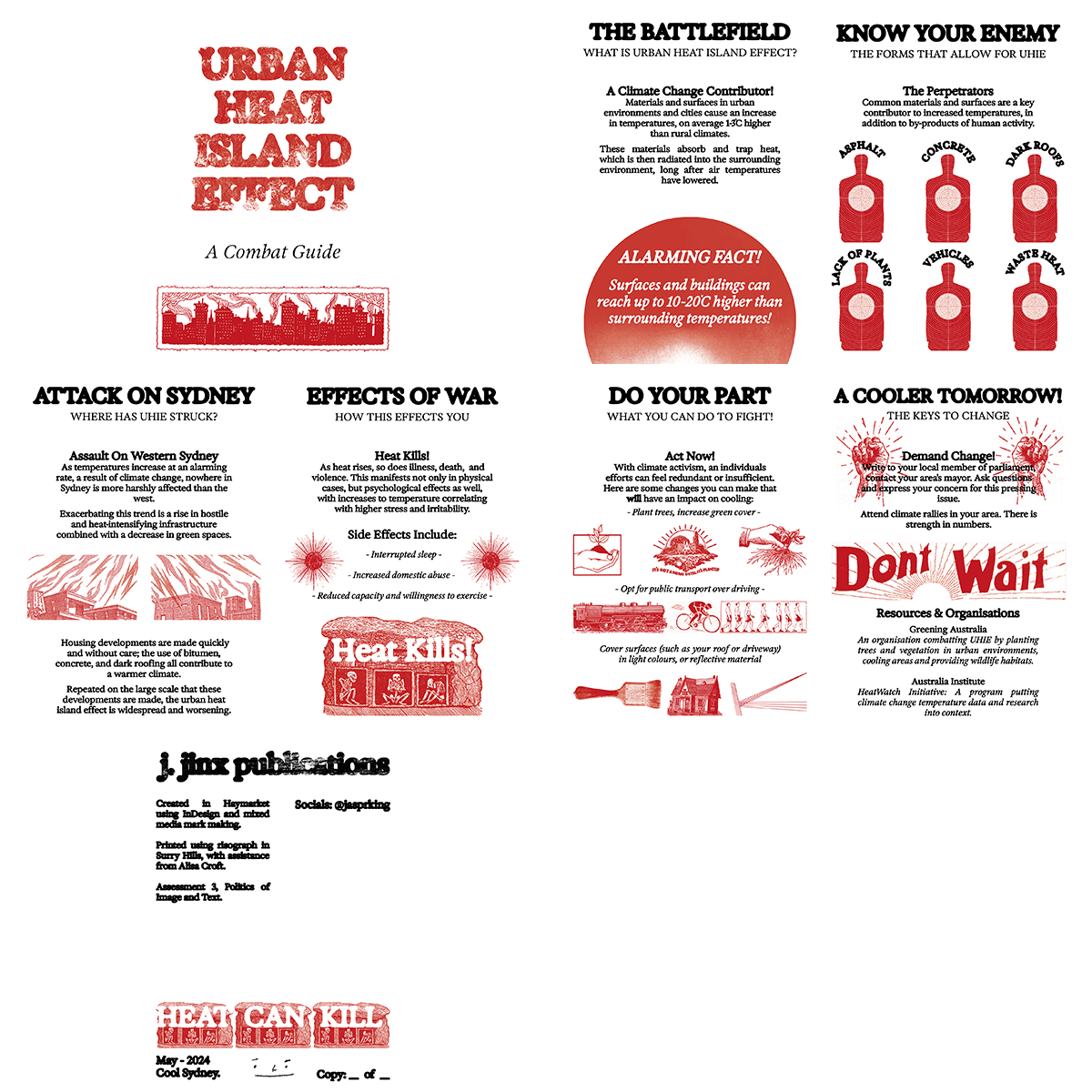
Flip through of final zine design.
Reflection
Through this project, I have been able to further develop design based skills. This took the form of practical mark-making, web development / gif creation, and printing using risograph. These processes have highlighted areas of which I lack knowledge and am passionate to improve on, namely a deeper understanding of html, css, and javascript, in addition to further printmaking techniques. Big thank you to Alisa for allowing me the privilege to use her risograph printer! Politics of Image and Text will be missed :(
References
- City Of Sydney. (N.D). Energy and climate change. https://www.cityofsydney.nsw.gov.au/environmental-action/energy-and-climate-change
- NSW Government. (2024). Climate change impacts on urban heat. AdaptNSW. https://www.climatechange.environment.nsw.gov.au/impacts-climate-change/built-environment/urban-heat
- The Australia Institute. (2018, November). HeatWatch - Extreme heat in Western Sydney. https://australiainstitute.org.au/wp-content/uploads/2020/12/Western-Sydney-Heatwatch-WEB.pdf
- Greening Australia. (2020, May 29). How can nature help tackle the Urban Heat Island Effect?. https://www.greeningaustralia.org.au/how-can-nature-help-tackle-the-urban-heat-island-effect/
- Sharifi, E., & Lehmann, S. (2014). Comparative Analysis of Surface Urban Heat Island Effect in Central Sydney. Journal of Sustainable Development, 7, 23-34. https://www.semanticscholar.org/paper/Comparative-Analysis-of-Surface-Urban-Heat-Island-Sharifi-Lehmann/6c012dca9109e11bcf5515b790ec5b4ba4f69b49
- Butler, Gavin. (2023, December 10). Inland From Bondi Beach, ‘Heat Islands’ Make Australia’s Summer Deadlier. The New York Times. https://www.nytimes.com/2023/12/20/world/australia/sydney-heat-islands.html